
“The only thing that matters is getting to product-market fit… Product-market fit means being in a good market with a product that can satisfy that market.”
— MARC ANDREESSEN
Marc Andreessen wrote these words back in 2007, coining the term product-market fit. While the concept has gained widespread adoption there remains a lack of consensus on what it means at a more precise level. For an early stage company, it is still really hard to both recognize the signs of product-market fit, as well as to optimally execute towards amplifying these early signals.
At Tribe Capital we recognize the importance of objectively measuring product-market fit and have developed frameworks to do so using company data. It has not been easy: we have exercised and refined these frameworks hundreds of times across companies in a wide variety of industries across our collective operating and investing history spanning companies such as Facebook, Slack, Front, Carta, and countless other early stage companies. But the payoff has been worth it. These analytical tools are not only useful to inform and improve our investment decisions, but also provide invaluable perspective for founders and operators looking to achieve or amplify existing product-market fit.
This article will first go into greater detail of why we believe a quantitative approach to product-market fit is important. Then it will outline in detail three types of analyses we employ at Tribe Capital to understand product-market fit in a given company. Finally, there are some closing thoughts regarding opportunities for further analysis as well as an appendix that addresses some frequently asked questions.
In addition, we wrote a companion piece to this article entitled “Unit Economics and the Pursuit of Scale Invariance” that extends the framework in this article to the consideration of unit profits.
Accounting for Product-Market Fit
A quantitative approach to product-market fit for startups is akin to the discipline of financial accounting. The income statement and balance sheet are the lingua franca for an established company to communicate the financial health of its business. These accounting concepts are often unhelpful when inspecting an unprofitable early-stage company. For a startup, what’s needed is a common quantitative language for what matters, namely, a quantitative framework for assessing product-market fit.
Just as larger companies employ accountants to monitor financial health (cash flows, profitability, etc), so to do product-oriented startups employ people to monitor the health of its product-market fit. They just go by a different name: data scientists. The term “data science” as currently used in the industry is quite broad and covers a wide spectrum of activities spanning what would be better thought of as ML engineering all the way to activities that are typically focused on decision-making and often referred to as “analytics”. For our purposes, we tend to use the latter end of the spectrum as there are numerically more data scientists in analytics style roles than in ML engineering style roles and because the analytics use case is more broadly applicable in early stage companies. In any case, from our point of view, accountants were the first data scientists.
The functional roles of accountants and data scientists are similar: take a big pile of raw data and use it to dig into important aspects of the business. Accountants work with a ledger of every financial transaction to answer whether the business is cash-flow positive, how costs are broken down between fixed and variable, what are the assets and liabilities, etc. Data scientists work with large datasets of customer activity to determine how the product is growing, how retention/churn is playing out, etc. This is why we have chosen to make data science a central component to what we are building at Tribe Capital.
In our development of frameworks for product-market fit, we have taken cues from the principles of accounting and tried to adhere to the following tenets:
- Simple: Definitions should be easy to understand.
- Detailed: Yet well-defined enough to be useful.
- Universal: Applicable to a broad range of products and businesses.
In accounting, the three most important frameworks for understanding a business are the balance sheet, income statement, and cash flow statement. These three statements do not provide a complete picture of a company’s health, but they provide a useful snapshot that can be used to benchmark it against other businesses across sectors.
Along those lines, we view product-market fit through three standardized analyses:
- Growth Accounting
- Customer Cohorts
- Distribution of Product-Market Fit
As with financial statements, we do not claim these analyses to be an exhaustive definition of product-market fit. Rather, they provide a consistent and extensible method for breaking down customer behavior while being detailed enough to be useful. Also note that most people think of product-market fit in binary terms – either you have it or you don’t. In contrast, we tend to think of it as a spectrum similar to the concept of “financially healthy” for a more mature business.
As investors, we use these analytical techniques to understand whether a company has achieved product-market fit. While these analyses are a critical component of our investment process, they are not the sole deciding factor but are rather a starting point for discussion. We use them the same way Warren Buffet uses financial statements to guide his investments. Does he look at them? Absolutely. Would he ever pass based on financial statements? Absolutely. Would he ever invest based only on financial statements? Hopefully not.
For founders and operators, these frameworks are useful to understand and amplify a company’s growth. We have found that nearly every successful technology company founded in the last two decades has employed them in one form or another. The frameworks provide precise concepts and quantitative relationships that are useful for understanding how customers engage with the company’s product while being universal enough to be applicable in almost any context in which the concept of product-market fit is useful.
Growth Accounting
The first technique we use at Tribe Capital when looking at a company is “growth accounting,” which breaks down overall growth in some activity across specific customer segments. The activity can be anything, though revenue and product engagement are the most common examples of growth accounting. To begin, we will focus on revenue and then abstract into engagement later on.
There are six categories that revenue can be bucketed into:
- New: Gained from customers were first active in the present time period.
- Churned: Lost when a customer who was active in the previous time period has no revenue in the present one.
- Resurrected: Gained from customers who had churned at some point in the past (and thus generated no revenue in the previous time period) but resumed in the present.
- Expansion: Gained from customers increasing revenue relative to the previous time period.
- Contraction: Lost from customers decreasing (but not to zero, otherwise they would be churned) revenue relative to the previous time period.
- Retained: Carried over by customers from the previous time period to the present one.
For example, a customer who spent $10 last month and $12 this month would have $2 in expansion revenue and $10 in retained revenue. However, if this customer instead spent $8 this month (while still spending $10 last month), then $8 would be counted as retained and $2 as contracted.
There are three important identities that express the definitions above:
- All revenue in the present time period is equal to the sum of the gains in revenue (new, resurrected, and expansion) and retained revenue.
- All revenue from the previous time period must either churn, contract, or be retained in the present time period.
- All change in revenue across a time period is equal to the sum of the gains (new, expansion, and resurrected) minus the sum of the losses (churned and contraction).
For the last identity, we can convert the terms into percentages (e.g. “% New” is new revenue divided by total revenue from the previous time period) to frame everything in terms of the overall growth rate.
There are three useful statistics that come out of growth accounting:
1. Gross retention is equal to retained revenue divided by total revenue from the previous time period.
2. Quick ratio is the sum of gains in revenue (new, resurrected, and expansion) divided by the losses in revenue (churned and contraction).
Quick ratio measures how efficiently a company is growing in terms of revenue gained per every unit of revenue lost. (By its definition, a quick ratio below 1.0x means that total revenue must be shrinking.)
3. Net churn is the sum of losses minus gains in revenue from existing customers only (i.e. excluding new customers) divided by total revenue from the previous time period.
Note that, by definition…
For example, a company with 2% net churn loses 2% of its revenue assuming that it generates no new customers. Note that net churn can be negative, which means that the company will grow revenue even without gaining new customers. Usually, negative net churn is achieved by the company getting significant expansion revenue from its customer base and is a positive signal in any business.
Below are two quick examples in which all of the above growth accounting terms can be applied.
The first example is generated data for a fictional product whose monthly revenue is graphed below alongside three lines — CMGR3, CMGR6, and CMGR12 – that track the compound monthly growth rate of revenue for the trailing three, six, and twelve months respectively.
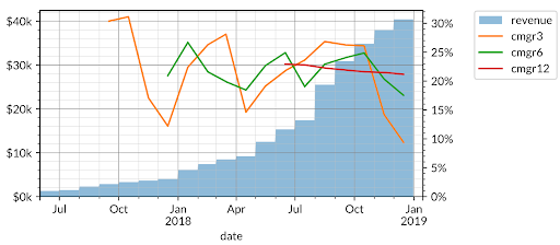
In the example above, the CMGR3 (3-month compound growth rate) dropped to 9% due to slower growth in the last few months, but the CMGR12 (which less sensitive to short term fluctuations) remains at 20%. These lines give us a sense of both growth rate and acceleration/deceleration.
We can apply the growth accounting framework outlined above to the company’s revenue and plot the gains (new, resurrected, and expansion) and losses (churned and contraction) in revenue on one axis; and gross retention, quick ratio, and net churn on the other axis.
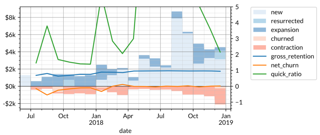
Notice how the spikes in new and contraction revenue in specific months affect the quick ratio in turn, suggesting that there is significant seasonality to the business. The 10% (CMGR3) growth rate for revenue can be broken down into growth accounting components:
This has a slightly negative net churn of -1% implying that the company would still be growing revenue even without adding new customers. These metrics are typical of a B2B SaaS company which often grows revenue not only by acquiring new customers but also by expanding revenue from existing customers. Good B2B customers also have low churn, which contributes to a significantly higher gross retention.
The second (once again, fictional) example is another whose revenue and CMGR3/6/12 are shown below.
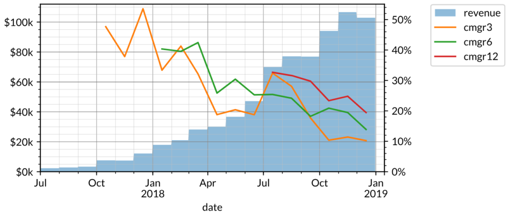
Over the past three months, the company in this example is still growing about as fast as the previous example (~10% CMGR3). However, growth has slowed significantly, since the CMGR12 (20%) is well above its CMGR3.
The growth accounting of this company is also very different: there is significantly more contraction and churn in the customer base, resulting in relatively low gross retention (<50%) and high net churn. Likewise, the quick ratio is below 2.0x.
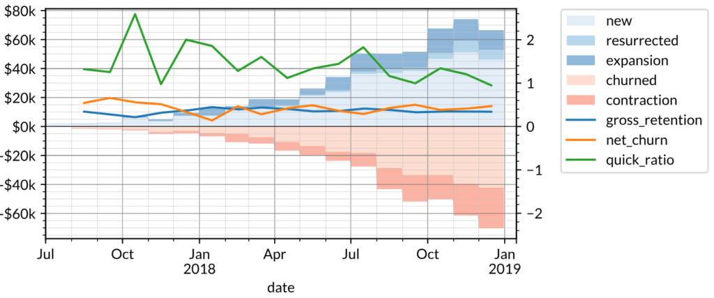
Typical discretionary spend products (often consumer-oriented as opposed to B2B) tend to look like this as there is no recurring revenue behavior to maintain retention.
Neither of these businesses are necessarily better or worse than the other because of these metrics. Rather, growth accounting helps us understand how the business has operated to-date and guides the next set of questions we would ask. For the enterprise company in the first example, those questions might revolve around whether the company can build out a sales team to maintain growth. For the consumer company in the second example, those questions might instead revolve around profitability per customer.
Revenue is only one quantity that we analyze using growth accounting. We also use this framework to analyze customer engagement. You could do this with something like “photos uploaded” or “messages sent” or even a more abstract quantity such as “days active in the month”. All of these quantities can be segmented in the same matter. You can also use this framework for quantities that are bounded such as “monthly active users” where the per-customer value is binary (true/false) as opposed to ordinal (such as photos uploaded). In that case expansion and contraction are always zero by definition and the rest of the formalism works the same.
If you’d like some help with computing this for yourself there is a useful PostgreSQL query here that calculates growth accounting amongst other things.
Cohorts
The second technique that we use is “cohort analysis”, which segments a company’s customers into groups based on when they became customers and measures each one as it ages. There are three common ones we use although, as with growth accounting, you can use these techniques on any per-customer quantity.
- Lifetime value (LTV): the cumulative activity of a customer cohort at a fixed time period (e.g. 12 months) after the customer first uses the product.
- Revenue retention: the percentage of a cohort’s initial activity that is retained at a fixed time period afterwards.
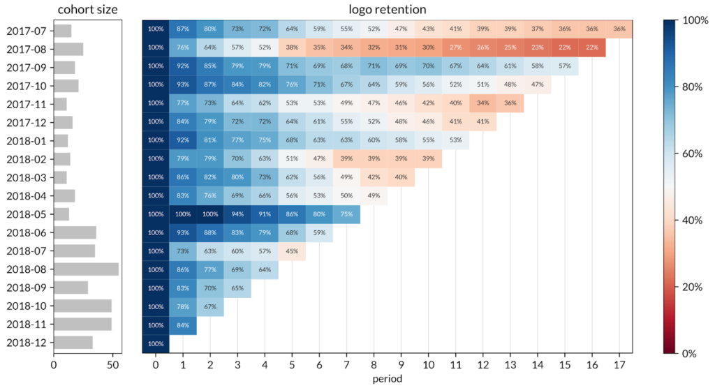
- Customer (logo) retention: the percentage of a cohort’s initial customers that is retained (i.e. still using/paying for the product) at a fixed time period afterwards.
How we visualize cohorts can have a significant effect on how we interpret them. For all of the metrics above, there are two ways to visualize them as line graphs: a plot of each cohort as it ages, or a plot of the trend across cohorts at a fixed age. The cohort data can also be shown as a heatmap to visualize both trends (across cohorts and through the lifetime of any single cohort).
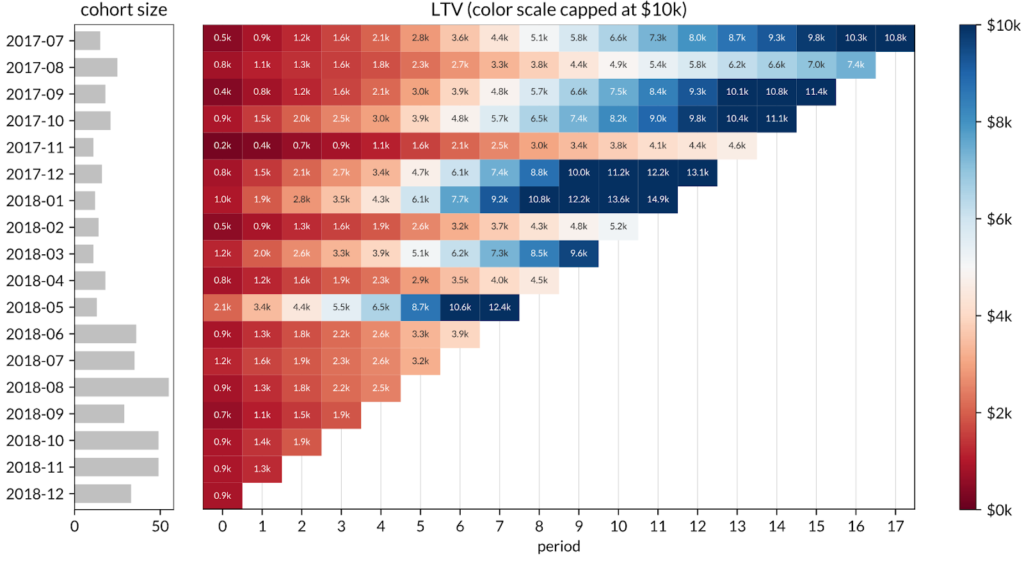
An example of the first visualization — plotting the LTV of each cohort as it ages – is shown below with fabricated data. For this graph, customers have been grouped together by the month they first paid revenue to the company. The x-axis tracks the months from the one in which the customers first paid (i.e. age of the cohort); the y-axis tracks the cumulative revenue per customer (i.e. LTV); and each line (i.e. the legend) represents a different monthly cohort. The dashed line is the weighted average of all cohorts at a given cohort age weighted by cohort size.
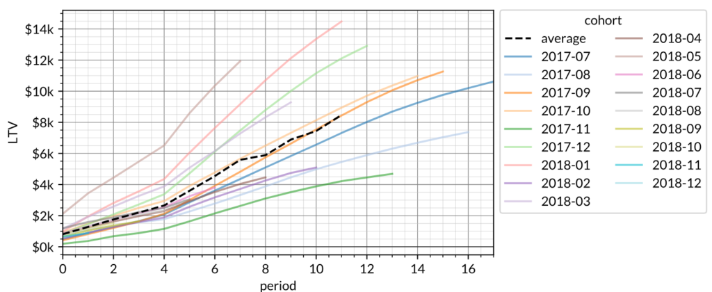
The most important takeaway from this chart is the shape of the lines. If the lines are “super-linear” (that is, they curve upwards – as the lines above do), that means customers actually average more monthly spend as they grow older. Some customers may churn, but other customers who retain will pay more to make up the revenue that is lost. If the lines are “linear” (straight), that means customers average the same revenue in future periods that they do in the initial period. Otherwise, the lines are “sub-linear” and customers are paying less on average in later months (due to contraction and churn) than they did in the first month.
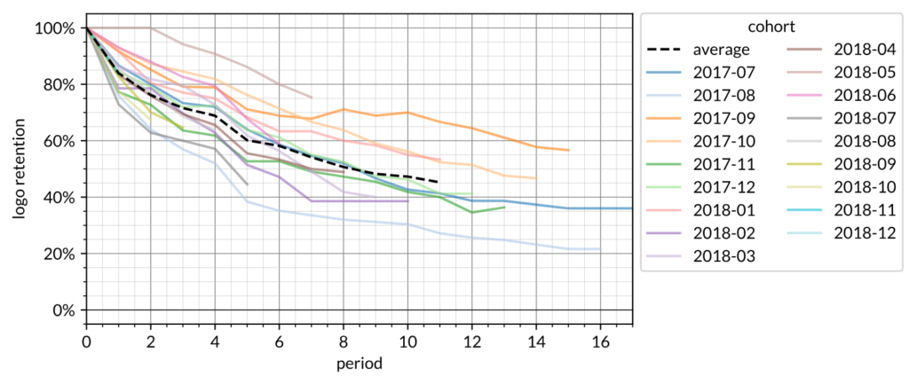
This next graph shows the cohort logo retention curves. The focus on this graph is whether logo retention has reached an asymptote at long duration. This particular example does not yet appear to show strong evidence of a flat asymptotic behavior although it may appear in the future as time passes.
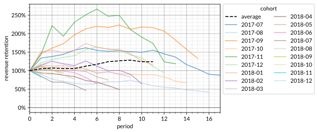
This next graph is cohort revenue retention. These are often greater than 100% because a cohort can be spending more than 100% the first month spend on a given future month. The graph here indicates that after 6 months the cohort revenue retention is ~120%. That this is predominantly >100% is the same as the fact that the cohort LTV curves are predominantly superlinear. This graph roughly measures the slope of the cohort LTV curves.
The second way to visualize cohort data is to focus on the trend at a fixed age. This effectively reverses the x-axis and the legend of the first graph: now cohort month is the x-axis, and each line represents a cohort age (in months).
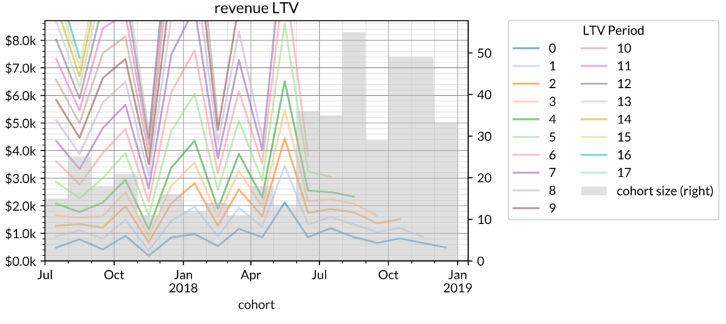
(Note: In the chart above, the grey bar graph on the right axis represents the size of the cohort.)
This graph allows us to observe differences among cohorts while holding cohort age constant. In the graph above, spikes in each line show that month’s cohort as having a higher LTV (in terms of cohort age) relative to customer cohorts before and afterwards. For example, from July 2017 to July 2018, the average customer LTV after 3 months (LTV Period = 3) increased from $1.2K to $1.8K; however, since July 2018 it has steadily decreased. The cohort size is included because it is common to see situations where cohort sizes are increasing while simultaneously shrinking LTVs. Acquiring a lot more customers isn’t necessarily great if you’re making so much less money on them that you end up in the same place or worse.
Our third visualization method is a heatmap which provides an alternative view of cohort behavior that makes it easy to look across both cohorts and cohort age while obscuring the shape of the curves. Heatmaps represent age effects (e.g. contract renewal) vertically; single cohort effects (e.g. a big marketing spend for one month) horizontally; and fixed calendar time effects (e.g. seasonality) diagonally.
As examples, here is the same revenue LTV data presented as a heatmap.
This is the customer (i.e. logo) retention data as a heatmap.
And finally revenue retention as a heatmap.
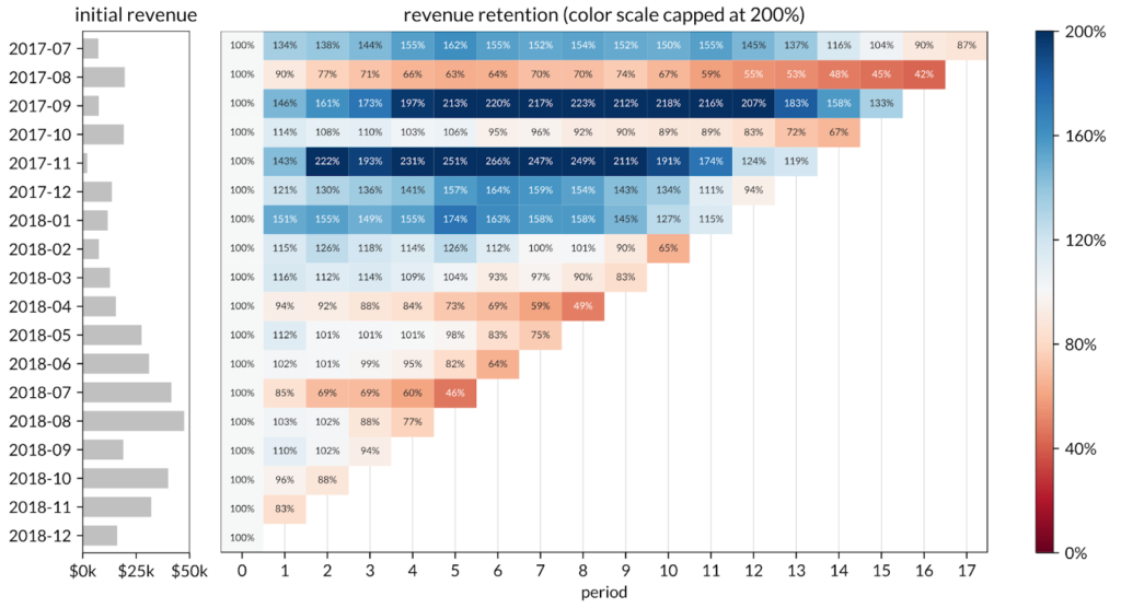
Reading each graph from left to right, we can see clearly which cohorts became outliers in either direction. Reading each graph from top to bottom, the heatmaps help you see the decrease in revenue retention and revenue LTV per customer in newer cohorts (as well as a slowdown in overall cohort size growth). This could be a signal of the company raising prices which results in the super-linear LTV growth among older cohorts while also simultaneously causing customer churn and lower LTVs in newer cohorts.
Let’s move on to a fascinating example that combines several effects at once. See below for the cohort heatmap for Intuit. This data is provided via consumer spending panel data by our friends at Second Measure and is a mixture of all Intuit online products (presumably primarily composed of Quickbooks and TurboTax).
The big seasonal effect for Intuit is tax season which appears as the diagonal stripes that happen every April. The big fixed age effect here is the annual renewal cycle, presumably for Quickbooks which are vertical stripes every 12 months. There are two fixed cohort effects worth mentioning in the data below. First, note the horizontal red bands. Those are cohorts from Feb-April each year which are dominated by Turbotax users and hence have low mid-year retention as there isn’t a big reason to use those products outside of tax season. This is in contrast with cohorts from the rest of the year which retain better likely because their composition more heavily favors the accounting products which bill monthly as compared with the tax products. The second fixed cohort effect is visible towards the bottom half where it appears that 2016 cohorts retained better than cohorts before or after. This was likely due either to product development or marketing efforts that were specific to 2016. It’s hard to see in the image but it turns out that 2017 cohorts were much larger than 2016 cohorts which may have also contributed to the apparent weakening in 2017 relative to 2016.

If you’d like help computing cohorts, there is a useful PostgreSQL query here.
Distribution of Product-Market Fit
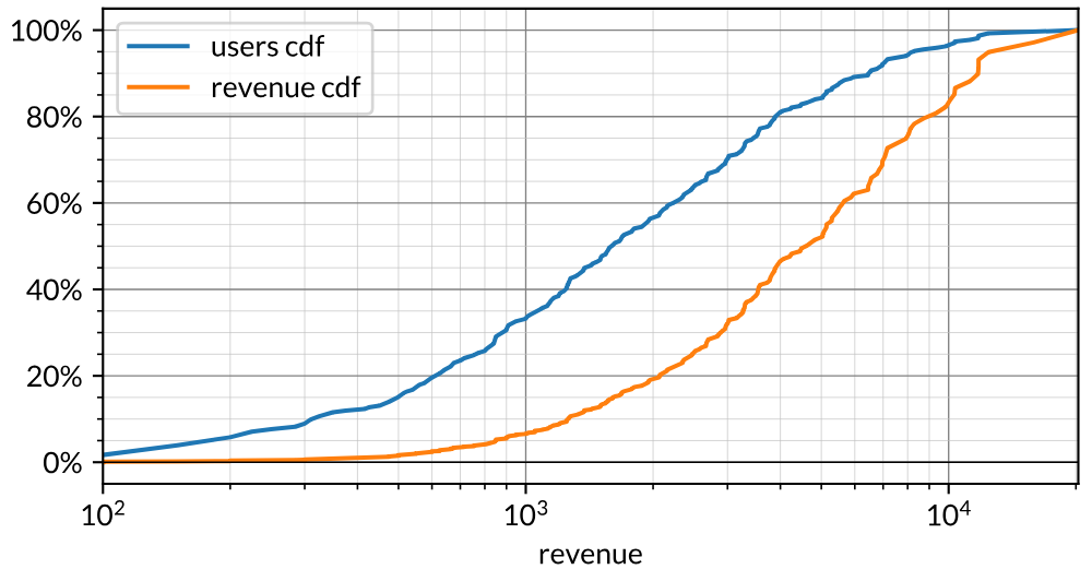
The third standard technique is to observe the distribution of product-market fit. In the case of revenue, this is typically done by inspecting the cumulative distribution function of monthly revenue. This does a few things for us. First, it gives us a sense of what “typical” looks like. Many companies quote average contract value (ACV) but this quantity tends to be dragged around by outliers and often doesn’t illustrate the “typical” customer. Of course, ACV is useful because that’s what actually hits the bank account, but we generally want to know both the ACV as well as the overall distribution of contract values and the CDF enables us to see the median and other percentiles/quantiles.
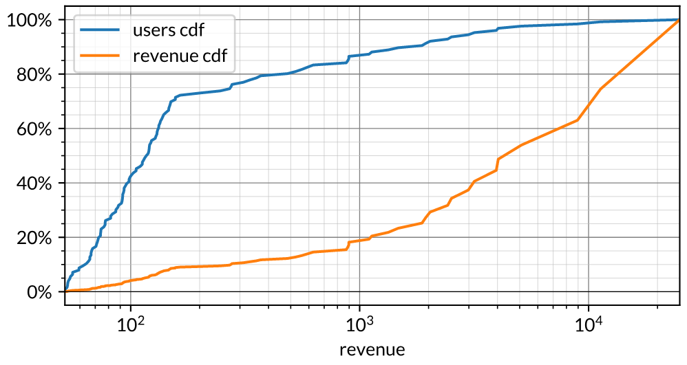
To begin, see below for a fabricated but nonetheless fairly typical distribution of revenue in a B2B business. The x-axis is revenue collected in a single month on a logarithmic scale and the y-axis is the cumulative percentage of customers on the blue line and revenue on the orange line. Let’s first focus on the blue line at the $4k revenue point on the x-axis. The blue line says that 80% of customers spent less than $4k. Conversely, the top quintile of customers spent more than $4k. The orange line above that same x-axis value says that 40% of revenue came from customers who spent less than $4k. Conversely, 60% of revenue came from customers who spent more than $4k. Said another way, “80/20” (i.e. the “Pareto principle”) for this business is “60/20”. This is fairly typical for an internet business. Technology “levels the playing field” in some sense and, as such, reduces the inequality in distributions of customers.
Here’s another fabricated example. This one is 90/20 concentrated with the top quintile spending more than $400 and such customers generating 90% of all revenue. The tail is pretty clear in this visualization as the top 5% of customers spend more than $4k per month and generate half of all revenue. In general, as the two lines separate it indicates a divergence in the distribution of customers and the distribution of revenue. Note that the blue line has a kink around $150 which indicates that there is a large chunk of customers around that price point probably indicating some sort of standard price package even though the bottom half doesn’t really contribute materially to revenue. Note that ACV for this particular distribution is around $500 which is quite a bit different from the median at $150.
We almost always find the CDF more useful than a histogram or other probability distribution function. This is because the CDF is less sensitive to bucketing whereas histograms tend to have bucketing issues. With B2B companies this technique helps to quantify concentration risk. When we come across an early-stage company with 20 customers but 90% of revenue comes from one or two of them we worry that the company is in some sense trending towards a consulting services company for their big customers rather than a high-margin venture-scalable product company.
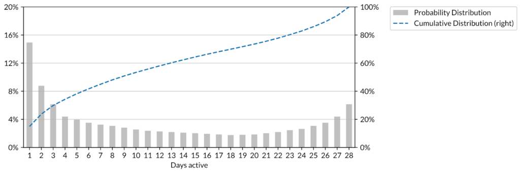
A slightly modified approach can be used to understand engagement. In this context the analysis is often phrased in terms of the concept of “L28”. Given N monthly active users, we plot the fraction that were active only 1 day in the month, then 2 days, and so on. For instance, a given product might have a median number of active days per month at 3 with the top quintile of users active more than 5 days. To give context, in highly engaging social networking applications, it is not unusual to see situations where the top quintile is at L28 over 20:
L28 distributions can be helpful even for just a handful of users. For example, we often see B2B SaaS companies that have perhaps a dozen paying customers but those customers have several hundred underlying users of the SaaS product. Inspecting the L28 distribution of those underlying users gives us a good sense of whether the users are actually using the product versus being in a situation where a particularly good salesperson (often the CEO) has managed to get some executives to pay for the product despite the absence of value being delivered to the end users.
Further thoughts and future directions
The three analytical techniques described in this article form the core of what we use as a standardized view of product-market fit. The framework works for product-market fit as defined through both revenue and engagement signals. While those two are the most common types of interactions that we inspect, part of the power of the framework is that it works for generic product metrics. For instance, say that you are working on an application where people are uploading photos. In that case, each uploaded photo can be thought of as a unit of product-market fit and you can use the frameworks above to break down growth accounting of photos uploaded, cohort uploading behavior and distribution/concentration of photos uploaded, etc.
This framework also has utility in understanding labor. For instance, say your company utilizes part-time drivers à la Uber/Lyft. In that case you might be monitoring the growth of wages paid to drivers and could analyze growth accounting on those wages, cohort level wages paid and distribution of wages. Indeed, when we look at two-sided marketplaces we think of them as two separate product-market fit problems. In order for a marketplace to “have product-market fit” it needs to have product-market fit with both demand and supply and the above framework provides an intuitive approach to understanding both sides.
Here at Tribe we are focused on working with great partners to help recognize and amplify early stage product-market fit. This article lays a bunch of the groundwork for how we think about these topics and hopefully it’s useful to you. If you have any questions feel free to email us at hello@tribecap.co. And stay tuned for more useful content in the future!
FAQ
Q: So… How do I know if I have product-market fit?
A: Flipping it around, how do you know if you are “profitable”? As discussed, there are many definitions of profitability and, depending on what you’re trying to get at, there are many possible answers. Similarly, we do not believe that having product-market fit is a binary black-and-white question. Rather, we believe there is a spectrum and that these tools help us understand where a given company sits on that spectrum. If you have high growth with healthy cohorts and reasonably distributed demand then you probably have product-market fit. If you have the cohorts and distribution but only tepid growth then maybe you do and maybe you don’t. The goal here is to replace the binary question of “do you have product-market fit” with a more nuanced and actionable framework for addressing the question.
Q: Do you think that anything could be cut from this framework?
A: We find that each of these frameworks gives us something different. They give an understanding of top line growth, the lifetime of a customer, and the degree of variability of pm fit across the customer base. Note that none of these quantities can be fully derived from the other. If you have cohort LTV curves alone you cannot reconstruct growth accounting because you don’t know how big each cohort is. Similarly, you cannot compute the distribution because you don’t know anything about the variation within each cohort. It should also be clear that you cannot compute things like cohort LTV or retention from the other two analyses.
Q: Do you think that anything should be added to this framework?
A: We have found through experience that these three analyses are usually sufficient as a starting point. That said, they have several shortcomings, some of which are worth discussing here. Perhaps most importantly, the frameworks described here only provide a picture of demand and do not provide any sense of whether or not the company can meet the demand while keeping a profit for itself. Concepts such as margin, profitability, unit economics, sales team efficiency, CAC, etc are not included in this framework. That’s actually on purpose. When we look at early stage companies the first thing we think about is how demand is presenting itself and only then do we start to think about the economics of satisfying the demand. In addition to that, incorporating costs into the above analytics turns out to be typically tricky because while transactional databases in modern software products typically contain atomic data on signals that reflect demand, there tends to be a lot of variation in how early stage companies keep track of and allocate costs (is the customer support salary COGS? Marketing? Is that information stored in a database?). We have standard approaches to many of these other topics but save their exposition for another day.
Note: We have written a second piece that deals specifically with costs and unit economics in a companion piece entitled “Unit Economics and the Pursuit of Scale Invariance”. See that article for further elaboration.
Q: What about unit economics, margins, etc?
A: See our “Unit Economics and the Pursuit of Scale Invariance” for a full description of how we handle this topic.
Q: What about TAM, competition, moats, etc?
A: The analytical framework presented here has nothing to say about these concepts. That said, several of these concepts can and do manifest themselves inside the quantities computed here. We leave their illustration as an exercise to the reader.
Q: How good/predictive is your model?
A: It’s worth spending some time on the concept of a “model”. In the world of data science people tend to use the word “model” to mean some sort of statistically trained classifier/regression/machine learning thing. In the world of finance and business people tend to mean some set of relationships between measurable quantities (usually expressed in Excel) that are useful to help understand the current business and potentially useful in an attempt to forecast. They tend to not worry too much about predictability because the unconstrained nature of business makes the notion of model fitness not very useful. We tend to think of our techniques more in the latter business-sense of the word “model”. In particular, we tend to think of this is as a “model” more akin to how investors use financial statements. Financial statements have utility far beyond forecasting and we have found that our frameworks are similar in that regard. Our approach to product-market fit is not a model that picks for us, rather, it’s a model that aids with seeing the world clearly. Our investment approach uses this as one of several inputs. You could ask “how good/predictive is the model of financial statements” but that question wouldn’t really make sense for the same reason why this question isn’t very well posed.
Q: Is this a new theory of startups?
A: Similar to the relationship between accounting and economics, this is not a theory per se but rather a set of definitions and widely applicable metrics. Accounting lays out definitions and standard ways of computing metrics from raw data and economics provides some theoretical models of how those variables affect each other in a dynamic system (i.e. a market). In a similar way, we think of this framework as a set of definitions on top of which one can build theories about how they interact with each other. Indeed, the core of economics is in some sense the idea of supply and demand and a theory about how they interact with each other to output the concept of price. In the modern world of the internet we are often in situations where supply is effectively infinite and marginal cost is zero. In that case traditional supply-demand analysis doesn’t provide much light into the situation. As such, what matters most is demand and we think of this framework as a useful approach to beginning any discussion of demand in the modern measurable world.
Q: Your model is incomplete because it doesn’t take into account XYZ?
A: Yes, it’s not meant to be exhaustive. It sacrifices fidelity for standardization and wide applicability.
Q: So if my company has/doesn’t have these metrics then you will/will not invest?
A: Definitely not! This is just one component of our investment process which weighs this alongside other traditional aspects such as team, market, and price.
Q: So will you compute this for me?
A: We do this hundreds of times per year both for companies that are looking for investment as well as for companies that simply want help. Feel free to reach out and we’ll see if we can do something for you.
Q: Is there software out there that can do this for me?
A: This is an interesting question. In the world of financial statements the standardization of financial statements is quite complete at this point. There was some level of rough standardization in the 1800s but it became completely standard in the early 1900s as the SEC came into existence and financial statements went from something that was potentially useful to the operator and the putative (implicitly private) investor to something that was needed for things like being listed in public equity markets, corporate tax collection and interacting with banks (i.e. getting business loans). Given the standardization of financial statements it’s relatively easy to get them computed from standard accounting software such as Quickbooks. In contrast, in the analytics world there is very little standardization. Every company wants to measure growth and product-market fit in their own special way and, as such, analytics products (Mode, Looker, Tableau, etc) all cater to that desire for extreme customization. This big PostgreSQL query can be picked apart and plugged into any of these analytics tools to implement these standardized analyses. To our knowledge, the query remains the easiest way to implement growth accounting and cohort analysis as of 2019.
Q: I’m building a product that does this! Will you fund me?
A: Along the lines of the previous question, our read of the ecosystem is that the market demand to customize analytics outweighs the desire to standardize analytics. As such, we haven’t yet seen sufficient evidence of the existence of a large unfulfilled demand for a product that provides this (or any) form of standardized analytics. It is possible that there is demand for standardized analytics but that the demand is better met through the fully customizable analytics products mentioned above rather than through a standalone product per se. That said, if you think you have a new approach to this problem or convincing evidence contrary to our observations of the ecosystem then we’d love to hear about it! Feel free to reach out.
Q: Where did these frameworks come from?
A: These frameworks were largely independently derived across a variety of companies in the early days of the social web. Folks at social gaming companies (think Zynga, Slide, LOLApps, etc) as well as at the networks themselves (i.e. Facebook, Twitter, etc) all ended up measuring similar things with the aim of quantitatively tracking growth. The underlying cause was that storage became cheap in the early 2000s and suddenly companies had huge amounts of log data which didn’t exist in the days of boxed software. As those companies grew it became natural to use that data to attempt to understand the growth of features within the products – for instance, tracking the growth/product-market fit of the photos app in FB or the direct messaging feature of Twitter. The frameworks presented here are the result of continued iteration and abstraction of those approaches across a multitude of companies and products in the ensuing decade.
Q: I’m working in data science/analytics at Company X. How is this useful for me?
A: As described in the introduction, the job of the modern data scientist has precedents that go much further back than most people realize. It’s useful to understand the history of utilizing raw data to help inform decision making because the vast bulk of problems that a data scientist/analyst faces in the job have been encountered before. The frameworks presented here are a very generalized set of tools that have been applied across a very wide swathe of product development and are likely useful in whatever business/product context that you are facing.
Thanks to Marc Andreessen for inspiration and support in the creation of Tribe Capital, Chamath Palihapitiya for helping to pave the way, Hiten Shah for reading multiple revisions of this article.